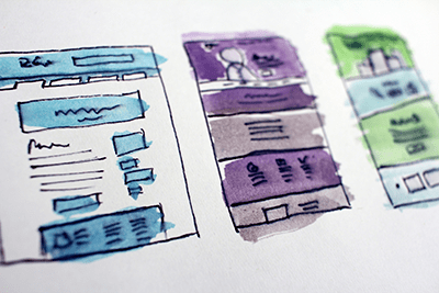
What Makes a Great Association Website?
If your member management system is one of the most important assets your association has in its arsenal (and, we certainly believe that it is), then your association website isn’t far behind. Reason being, your website serves as the landing ground for everyone affiliated with your association (whether they’re already a member, or soon will be). Your website has to have a lot of curb-appeal to ensure people give your association a chance. If your association’s exterior isn’t effectively selling its interior, many prospective members will miss out on the value you have to provide.
So, with all that granted, how do you ensure your website is positively impactful? What should you consider when either building or revising your website? The answer is not black and white. There’s quite a bit that you need to factor in. However, there are some key elements that, no matter what industry your association services, you’ll need to think on. We have included a list of these elements, for your reference. The most important thing to know is that your association has to have themselves figured out before anyone else can figure you out. Before you can meaningfully deploy any of the following strategies for your website, you need to know your association inside and out.
- Intuitive
- This element goes for any site on the web – not just association websites. Your site needs to be logic-based. That is to say, navigating through the various pages of your site should be self-evident. The pathways from one location to the next should make sense and be obvious to any given user. We live in easily frustrated times. We have become so accustomed to the speed, ease-of-access, clarity and convenience of how the web has come to function that anything less seems intolerable. We’ve been conditioned to feel entitled to intuitive user experiences. Since this is the case, your association needs to be extremely particular and mindful of its website design and functionality. If your site isn’t simple to reconnoitre, visitors will retreat from its bounds pretty quickly – causing your association to lose members.
- Compatible
- Your website should definitely be mobile-friendly – for obvious reasons. A good portion of us access the internet via our smartphones, so your association website has to accommodate that. However, it’s not just about ensuring your site is compatible with mobile devices – it’s about exemplifying compatibility with the future. Doing a cursory review of your site on a smartphone is sometimes just a Litmus test to confirm whether your association is with the times. The visitor may not even do a deep-dive into what you offer until they can review your content on a computer screen. It tells a pretty unflattering story if your website is not responsive to screen size. The visitor will get the sinking feeling that your association is out of touch with common practice and not serious about the growth of your community. Screen responsiveness is just one of the those features your website has to have.
- Accurate
- The look and language of your website has to be in line with what it is that you’re offering. Search engines do not take kindly to tricky or confusing content that fails to represent what you provide accurately. The information you choose to include needs to be suitable. If it misses the mark or is inflated beyond reality, this will negatively impact your target audience’s ability to find your website. Just be honest with your content. Package it in an appealing fashion but say it like it is. There’s no need to trump things up when your offering is great already. Plus, your prospects will be able to better evaluate what they are getting out of becoming a member.
- Alive
- It should be clear to both current and prospective members of your association that your website is a living, breathing entity. Your association isn’t this static, unchanging thing – so, why would your website be? Visitors to your site need to feel that what they are looking at is in a constant state of refresh. Everything from the content to the design of the website should move along with your association as it shifts and changes. If you don’t treat your website as a vessel that represents your association’s evolution, visitors will interpret your site as a stagnant environment and will transfer that sense to your association as well.
- Connected
- Most of the time, people will find your website by way of your social media presence. However, every once and awhile, visitors skip a step and happen upon your website without ever interacting with your social media accounts. There’s nothing wrong with that – but, you’ll want to make sure you give them the opportunity to opt for consuming your social media content. Through your social media accounts, visitors will be able to review different content than what they can through your website (short-form as opposed to long-form). So, in order to ensure visitors don’t miss out on unique content, connect them to those social media accounts via your website. A lot of effort goes into your social media strategy – don’t let it go to waste.
- Stimulating
- Everyone is so busy these days that their time is a prized commodity. So much so that people will only donate a small window of attention to evaluate whether they should proceed to offer up more of their time to sincerely invest themselves in your content. Since this is the case, your association needs to pull every stop on your website to garner that time investment. Good content is the hook, but impactful visuals are the bait. Visually stimulating, appropriate and well-placed images will literally grab a visitor’s eye and allow them to catch key pieces of content that capture their interest. You don’t want sensory overload – just visual enough to stimulate intrigue.
- Familiar
- Your website should look and sound like you. Your visitors are either members or prospects. That means they either know you very well or not at all. So, your website’s task is to be familiar to those who know your association and become familiar to those who don’t. To ensure your content stays on brand, you really need to have members of your team strategizing its formulation and application. If you’re shooting from the hip with your content, or it’s being written by different authors without a consolidated approach, there’s little chance it will read harmoniously. Content that is incompatible with your brand identity will give visitors the sense you aren’t sure of your own organizational narrative and culture – which will disenfranchise members and discourage prospects in their respective affiliations with your association.
- Concise
- Your website should make it clear what you want the visitor to do. Your content should be delivered in a concise manner so people don’t get confused on what it is that is being asked of them. Your calls to action should be easily identifiable and almost jump out at the user. However, you need to be careful with how many requests you levy within your content. Too many calls to action will confuse and overwhelm the visitor and will prompt them to back away from your website and association. Keep your asks specific and to the point.
- Narrative
- Tell your association’s story in a narrative way. Instead of just listing out the value you provide to members, offer it through descriptive content that explains what your association is all about. Bulleted lists are uninspiring and boring. But, if you can convey your value in a narrative way, people won’t feel they are being force fed what you believe to be your value proposition. They will instead feel like they’ve interpreted your value themselves – without being told. Telling your association’s story in a genuine way makes it seem like you’re not crafting a sell-job.
- Personal
- The most comfortable style of communication is conversational. If you can make visitors feel like the words they are reading are coming from a person instead of a robot or a brick wall, that’s going to help your case in the long run. Make your content personal – use “you” language. You’ll want to make the visitor feel like they are being spoken to directly, as much as possible. The more comfortable you can make a website visitor feel, the more likely they are to stick around longer to find out more.
- Automated
- Whatever you can make easier for your website visitors, the better. This is especially true when it comes to fillable forms. Fields that can estimate information based on the beginning of a word (such as pulling geographical locations or addresses) expedite the annoying fill-out process. Also, for returning visitors who have previously provided their information, forms that are able to draw from stored memory make completing an application, renewal or the like much faster. Any process that can be made less monotonous via automation will encourage visitors to see these necessary evils through.
- Streamlined
- o Lastly, the transition between your public-facing website and members-only AMS should be so seamless that you can barely tell they are two separate entities. The themes and colour schemes of your website and AMS should match up so well that it looks like they were developed by the same provider (and, they can be if you choose Guild as your AMS provider). The member login portal accessed through your website should be simple to find and provide quick access to the members’ area for those who have the proper credentials. Nothing builds more confidence in members and prospects than professionally presented content and design that matches up and seems to be fluid.
Your association website is one of your greatest tools in showing to the world who you are and what value you bring to your membership. It’s well worth your time to ensure your website performs exceptionally in both functionality and form. Play with your creative concepts to make sure you are striking the delicate balance, in your content and design, necessary to capture visitor’ attention and interest. Then, once they’ve committed their time, motivate them to act by keeping things simple and clear.
If you’d like to learn how Guild can both develop and host your website and implement a customized AMS for your association (all under one roof), click here to speak with one of our representatives.